Visual Analytics
A test report generated by Allure includes a number of charts built from test data. These charts provide different types of insights into your test suite: snapshots of current state, trends over time, project health indicators, and performance metrics.
When someone is familiar with your project and looks at its test reports regularly, they can get a rough idea of the project's current status by just glancing at the latest test report.
Here are some of the tricks a reader can adopt in a well-organized project:
- The more green color there is on the charts, the better: see the Test statuses, various trend and distribution charts.
- The less critical are the severity values for the failed tests, the better: see the Severity chart.
- The faster most tests run, the better: see the Duration and the Duration dynamics charts.
- Unless the tests have been rewritten or intentionally deleted, there shouldn't be any red on the coverage diff map.
- A deep and extensive status age pyramid indicates persistent issues worth prioritizing.
TIP
All trend charts, the duration dynamics chart, the coverage diff map and the status age pyramid rely on historical data, so if you want to use them, make sure to enable history first.
Allure 3 vs Allure 2
Allure Report 3 has many more chart types than Allure Report 2, and still lacks a few that Allure 2 has. To indicate which version supports a certain chart type, they are marked with version badges throughout this document: Allure 3 or Allure 2, or both.
Where to see charts
- In Allure Report 3, click on Report in the top left corner of the home page. Or configure a charts-only report with the Dashboard plugin.
- In Allure Report 2, charts are split between the Overview and Graphs tabs.
Charts configuration
Unlike Allure Report 2, all Allure Report 3 charts are configurable. You can choose to include them into your reports or not, and most of them are customizable.
Refer to the example below for a full charts configuration example, and explore the following sections of this document to learn how each chart looks and works and what the configuration options affect.
Charts configuration examples for Allure Report 3
import { defineConfig } from "allure";

// Charts configuration with all chart types and all options set to default values
const allChartsDefaultValues = [
  {
    type: "currentStatus",
    title: "Current status",
    statuses: ["passed", "failed", "broken", "skipped", "unknown"], //included statuses
    metric: "passed", // status used to calculate the central percentage value
  },

  {
    type: "testResultSeverities",
    title: "Test results by severities",
    levels: ["blocker", "critical", "normal", "minor", "trivial"],  //included severities
    statuses: ["passed", "failed", "broken", "skipped", "unknown"], //included statuses
    includeUnset: true, //whether to show the “No severity“ section
  },

  {
    type: "statusDynamics",
    title: "Status dynamics",
    limit: 10, // number of shown runs, including the latest
    statuses: ["passed", "failed", "broken", "skipped", "unknown"], //included statuses
  },

  {
    type: "statusTransitions",
    title: "Status transitions",
    limit: 10, // number of shown runs, including the latest
  },

  {
    type: "testBaseGrowthDynamics",
    title: "Test base growth dynamics",
    statuses: ["passed", "failed", "broken", "skipped", "unknown"], //included statuses
    limit: 10, // number of shown runs, including the latest
  },

  {
    type: "coverageDiff",
    title: "Coverage diff map",
  },

  {
    type: "successRateDistribution",
    title: "Success rate distribution",
  },

  {
    type: "problemsDistribution",
    title: "Problems distribution by environment",
    by: "environment", //can only be grouped by environments
  },

  {
    type: "stabilityDistribution",
    title: "Stability distribution by features",
    threshold: 90, // acceptable stability level in %
    skipStatuses: ["skipped", "unknown"], //skipped test statuses
    groupBy: "feature", //by what label to group the tests together
  },

  {
    type: "stabilityDistribution",
    title: "Stability distribution by epics",
    threshold: 90, // acceptable stability level in %
    skipStatuses: ["skipped", "unknown"], //skipped test statuses
    groupBy: "epic", //by what label to group the tests together
  },

  {
    type: "stabilityDistribution",
    title: "Stability distribution by stories",
    threshold: 90,  // acceptable stability level in %
    skipStatuses: ["skipped", "unknown"], //skipped test statuses
    groupBy: "story", //by what label to group the tests together
  },

  {
    type: "durations",
    title: "Durations histogram",
    groupBy: "none", //whether to group the tests by layer (other labels not supported)
  },

  {
    type: "durations",
    title: "Durations by layer histogram",
    groupBy: "layer", //whether to group the tests by layer (other labels not supported)
  },

  {
    type: "durationDynamics",
    title: "Durations dynamics",
    limit: 10, // number of shown runs, including the latest
  },

  {
    type: "statusAgePyramid",
    title: "Status age pyramid",
    limit: 10, // number of shown runs, including the latest
  },

  {
    type: "testingPyramid",
    title: "Testing pyramid",
    layers: ["unit", "integration", "e2e"], //layers of the pyramid, bottom to top
  },
];

export default defineConfig({
  name: "Allure Report",
  output: "./allure-report",
  // history file configuration is required to populate most charts
  historyPath: "./history.jsonl",

  plugins: {
    awesome: {
      options: {
        reportName: "Allure Report",
        singleFile: false,
        reportLanguage: "en",
        // charts configuration used within the Awesome report
        charts: allChartsDefaultValues,
      },
    },

    dashboard: {
      options: {
        reportName: "Dashboard",
        singleFile: false,
        reportLanguage: "en",
        // charts configuration used in a Dashboard report
        layout: allChartsDefaultValues,
      },
    },
  },
});import { defineConfig } from "allure";
export default defineConfig({
name: "Allure Report",
output: "./allure-report",
historyPath: "./history.jsonl",
plugins: {
awesome: {
options: {
reportName: "Allure Report",
singleFile: false,
reportLanguage: "en",
charts: [
{
type: "currentStatus",
},
{
type: "testResultSeverities",
},
{
type: "durations",
},
{
type: "testingPyramid",
},
],
},
},
},
});TIP
If you do not configure charts in Allure Report 3, all available chart types will be included by default.
Test statuses chart Allure 3 Allure 2
Test statuses chart is a pie diagram showing how many tests got each status in the latest run.
The numbers in the center of the pie chart indicates the percentage of test cases that passed relative to the total number of tests.
On the right side of the chart, three additional metrics are shown:
- New tests - the number of tests that appear in this report for the first time
- Flaky tests - the number of unstable tests with historically inconsistent results
- Retries - the total number of test that had to be rerun
If there are no new, flaky or retried tests, these metrics are not shown.
Allure 3 configuration example
You can set the following options for this chart in the configuration file:
{
  type: "currentStatus",
  title: "Current status", //chart name
  statuses: ["passed", "failed", "broken", "skipped", "unknown"], //included statuses
  metric: "passed", // status used to calculate the central percentage value
}
Severity chart Allure 3 Allure 2
The severity chart groups tests by both their statuses and severity.
The assignment logic for tests without an explicitly specified Severity level varies between Allure versions:
- In Allure 3 the test is added to the “No severity“ count and placed in the rightmost section. You can disable this section.
- In Allure 2 the test is treated as having the “normal” severity level and is displayed in the middle section, while the tests with other severity levels are placed to the left or right of it.
In some projects, it may be considered acceptable to have some number of “normal”, “minor” or “trivial” test failures, but not acceptable to have any “critical” or “blocker” ones. To roughly understand the current stability in such a project, a reader can just check how the different test statuses are distributed across the chart. As a general rule, the farther a red bar is placed to the left, the more attention it needs.
The test status colors have the same meanings as on the test statuses chart.
Hover the mouse pointer over a column to see the counts of the tests with the corresponding status and severity.
Allure 3 configuration example
You can set the following options for this chart in the configuration file:
{
  type: "testResultSeverities",
  title: "Test results by severities", //chart name
  levels: ["blocker", "critical", "normal", "minor", "trivial"], //included severities
  statuses: ["passed", "failed", "broken", "skipped", "unknown"], //included statuses
  includeUnset: true, //whether to show the “No severity“ section
}
Trend charts
The trend charts show how a certain value changed over time. Each section corresponds to a certain version of the test report, with the last line on the right corresponding to the current version.
INFO
See Tests history to learn how to populate the trend charts with historical data.
Status dynamics Allure 3 Allure 2
The status dynamics chart illustrates how the number of test results in each status changes over time (from older runs to the most recent one). The colors that indicate tests with each status are the same as in the test statuses chart.
This visualization makes it easy to:
- Identify increases or decreases in problem statuses
- Observe growth or reduction in the overall test suite size
- Quickly compare historical runs with the latest report
Allure 3 configuration example
You can set the following options for this chart in the configuration file:
{
  type: "statusDynamics",
  title: "Status dynamics", //chart name
  statuses: ["passed", "failed", "broken", "skipped", "unknown"], //included statuses
  limit: 10, // number of shown runs, including the latest
}
Status transitions Allure 3
The status transitions chart visualizes how test results change between consecutive executions by showing the number of tests that transitioned from one status to another over time.
Each time point displays bars representing different types of transitions:
- Fixed - a test that was previously
failedorbrokenand is nowpassed - Regressed - a test that was previously
passedorbrokenand is nowfailed - Malfunctioned - a test that was previously
passedorfailedand is nowbroken
A linear trend line is overlaid on the chart to indicate the overall direction of status changes:
- A positive slope indicates that more tests are being fixed than broken
- A negative slope indicates that breakages and regressions outweigh fixes
The status transitions chart helps teams to:
- Assess the amount of regression between test runs
- Tune test result analysis strategies by taking into account the ratio of recent failures to long-standing (stale) failures
- Monitor execution history for unexpected spikes in transitions, including both sudden breakages and mass fixes
Allure 3 configuration example
You can set the following options for this chart in the configuration file:
{
  type: "statusTransitions",
  title: "Status transitions", //chart name
  limit: 10, // number of shown runs, including the latest
}
Test base growth dynamics Allure 3
The test base growth dynamics chart illustrates how the test suite evolves over time by showing the number of newly added and deleted tests for each test status.
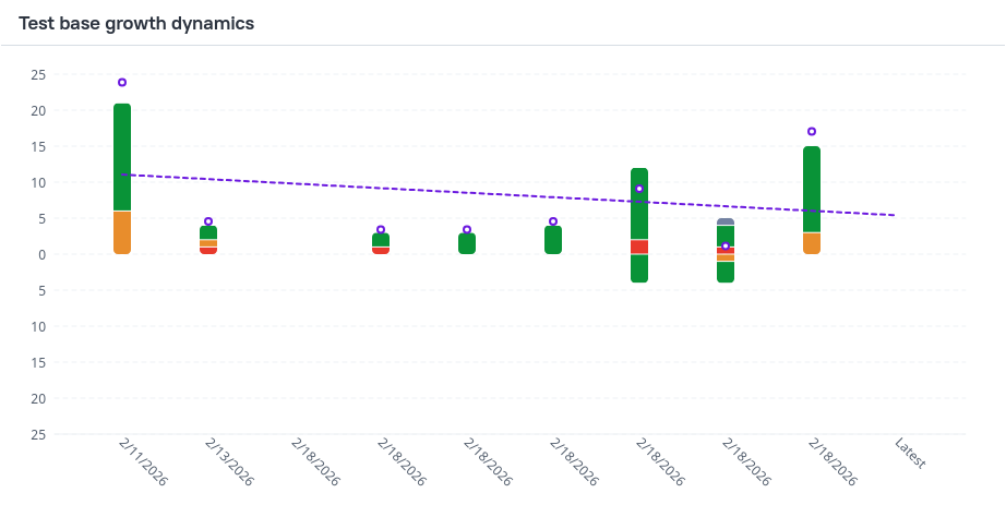
The chart is displayed as a stacked bar chart with a trend line, where positive values indicate added tests and negative values indicate deleted tests
Each bar is divided into colored segments representing test statuses (for example: passed, failed, broken, unknown, skipped), allowing you to see how changes in the test base are distributed across result types.
A linear trend line is overlaid on the chart to highlight the overall direction and speed of test base changes:
A positive slope indicates:
- that more tests are being added than removed
- or hat the amount of new tests per run is growing
- or that the amount of deleted tests per run is declining
A negative slope indicates:
- that test deletions outweigh additions
- or that the amount of new tests per run is declining
- or that the amount of deleted tests per run is growing
The test base growth dynamics chart helps teams to:
- Assess whether the test suite is growing or shrinking over time
- Tune test result analysis strategies by accounting for recently introduced tests and failures
- Detect accidental test removals that may reduce coverage
- Prevent unexpected additions of failed or broken tests
- Understand whether changes in test stability are caused by regressions or by changes in the test base itself
Allure 3 configuration example
You can set the following options for this chart in the configuration file:
{
  type: "testBaseGrowthDynamics",
  title: "Test base growth dynamics", //chart name
  statuses: ["passed", "failed", "broken", "skipped", "unknown"], //included statuses
  limit: 10, // number of shown runs, including the latest
}
Retries trend Allure 2
- The Retries trend chart shows the total number of retries the test runner did for all the tests.
Categories trend Allure 2
- The Categories trend chart shows the number of test defects and product defects. See also: Categories chart.
Coverage diff map Allure 3
The coverage diff map visualizes how test coverage for application features changes between the previous and the latest test run. It highlights which features are affected by new, removed, enabled, and disabled tests in the most recent run.
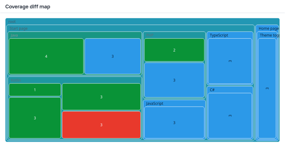
This chart is a tree map built from test results that have epic, feature and story labels.
- Rectangles represent individual features
- Hierarchy reflects the feature structure
- Rectangle size represents the number of tests covering the feature
- Green sections indicate the parts of your test base that had tests added or enabled in the most recent run, and the red sections are the ones that had tests deleted or disabled.
The coverage diff map helps teams to ensure adequate coverage and prevent unintended test deletion.
You can only configure the chart name for this chart.
Success rate distribution Allure 3
The success rate distribution chart visualizes how test success rates are distributed across your test base, grouped by application features.
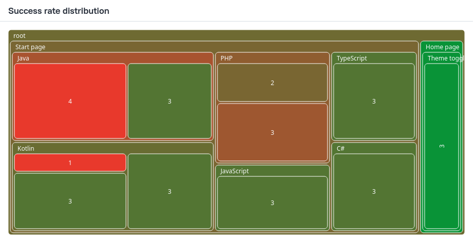
This chart is a tree map built from test results that have epic, feature and story labels.
- Rectangles represent individual features
- Hierarchy reflects the feature structure
- Rectangle size represents the number of tests covering the feature
- Rectangle color represents the average success rate of those tests, with 100% being green, and the lower the success rate, the redder the rectangle
The success rate distribution chart helps teams to:
- Tune test result analysis by considering both feature size and test reliability: large features with a low success rate typically require the highest attention
- Identify poorly covered or unstable areas of the system under test
- Prioritize stabilization and additional testing efforts based on impact rather than raw failure counts
You can only configure the chart name for this chart.
Problems distribution by environment Allure 3
The problems distribution by environment chart visualizes how test failures are distributed across features and execution environments, helping identify environment-specific and feature-specific issues.
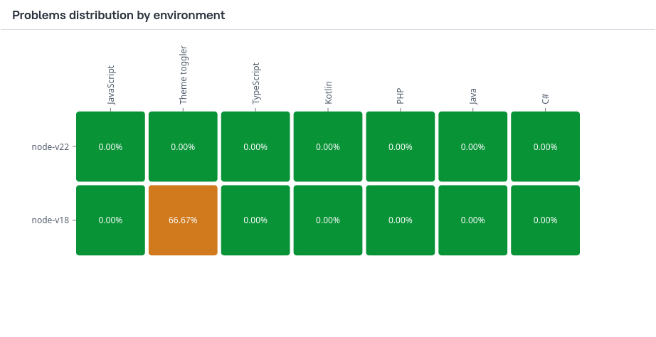
Only tests with a feature label are included in this chart.
This chart is a heat map, where each cell is a feature–environment combination.
- Cell value shows the percentage of failed tests relative to the total number of tests for that feature in the given environment
- Color represents failure intensity: with 0% failures being green, and the higher the failure rate, the redder the rectangle
The problems distribution by environment chart helps teams to:
- Detect environment-specific failures, such as issues limited to a particular OS, browser, or configuration
- Assess overall environment health by spotting environments with consistently high failure rates
- Prioritize test result analysis by focusing on the most broken feature–environment combinations
- Validate that expected functionality behaves consistently across supported environments
You can only configure the chart name for this chart.
Stability distribution Allure 3
The stability distribution charts show how test stability is distributed across different categories of the test suite, such as layers, features, stories, epics, and other labels.
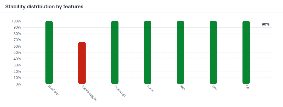
By default Allure creates three stability distribution charts organized by the following labels:
epicfeaturestory
Test stability is calculated as the percentage of stable executions within a certain category.
- A horizontal threshold line indicates the acceptable stability level (90% by default).
- Bars below the threshold highlight potentially unstable areas
The stability distribution charts help teams to:
- Identify unstable areas of the test suite across different dimensions
- Detect risk zones where test reliability falls below an acceptable threshold
- Prioritize stabilization efforts based on category-level trends rather than individual tests
Allure 3 configuration example
You can set the following options for this chart in the configuration file:
{
  type: "stabilityDistribution",
  title: "Stability distribution by features", // chart name
  threshold: 90, // acceptable stability level in %
  skipStatuses: ["skipped", "unknown"], //skipped test statuses
  groupBy: "feature", //by what label to group the tests together
  groupValues: ["Authentication", "Payments"], //(optional) included values of the grouping label
}
Tests can be grouped by the following labels:
featureepicstorysuiteseverityowner- Custom labels using the following format:
groupBy: "label-name:<string>"
Duration charts
Durations histogram Allure 3 Allure 2
The main duration chart divides all the tests into duration buckets based on how long it took to complete them.
The chart uses a logarithmic scale to make it easier to distinguish columns that represent similar values.
If your project does not have any tests that take long time by design, this chart often displays the largest groups of tests to the left. If a test takes longer than others and thus is placed into the groups to the right, this may be an indicator of a problem within the test or even the product feature it works with: for example, an attempt to load a resource from a slow server. Also, a test's long duration is caused by a large number of retries.
Note, however, that sometimes a test's duration can be affected by various external factors, such as the amount of free operating memory on the machine. It is usually a good idea to run the tests again, if possible, to confirm that a test's long duration is a persistent problem.
The durations histogram chart helps teams to:
- Understand overall test performance and execution time distribution
- Identify performance bottlenecks
Allure 3 configuration example
You can set the following options for this chart in the configuration file:
{
  type: "durations",
  title: "Durations histogram", // chart name
  groupBy: "none", //whether to group the tests by layer (other labels not supported)
}
Durations by layer Allure 3
This chart is a version of the durations histogram, with all tests grouped by the layer label (for example: unit, integration, e2e).
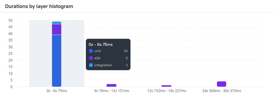
Note: If you don't set the layer label for your tests, this chart will be empty. No other labels are currently supported for this chart.
When grouping by layer is enabled, the durations histogram is rendered as a stacked bar chart, where each stack segment represents a specific testing layer, showing its contribution to the total number of tests in each duration bucket.
The layer grouping helps to:
- Analyze performance impact by testing layer
- Detect layers that disproportionately contribute to long-running tests
Allure 3 configuration example
You can set the following options for this chart in the configuration file:
{
  type: "durations",
  title: "Durations by layer histogram", // chart name
  groupBy: "layer", //whether to group the tests by layer (other labels not supported)
}
Durations dynamics Allure 3
The durations dynamics chart shows how test execution durations change over time, comparing execution time with serialized duration and tracking the speedup coefficient.
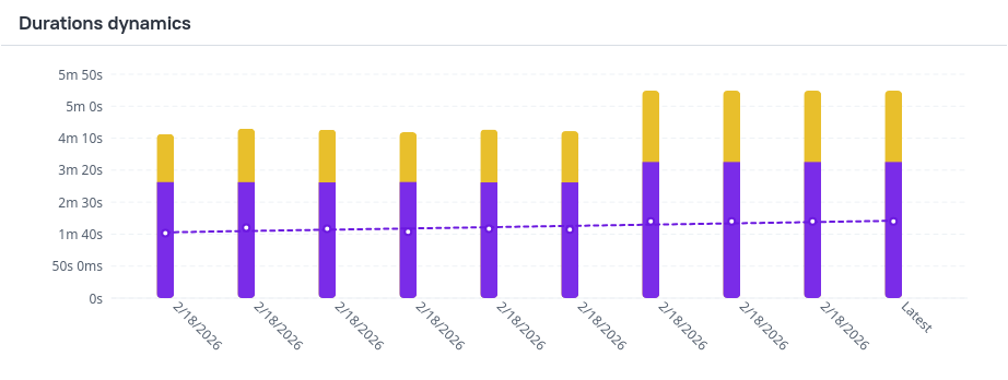
Each bar is composed of:
- Serialized duration - the total execution time if all tests were run sequentially
- Duration - actual execution time of the test run
A trend line overlays the chart to show how the speedup coefficient evolves over time.
Speedup Coefficient
The speedup coefficient reflects the effectiveness of parallel execution and resource utilization.
Higher values indicate better parallelization and more efficient use of available resources.
The durations dynamics chart helps teams to:
- Assess resource utilization and the effectiveness of parallel test execution
- Investigate performance regressions in test runs
- Evaluate the performance impact of recent changes in the test suite or infrastructure
Allure 3 configuration example
You can set the following options for this chart in the configuration file:
{
  type: "durationDynamics",
  title: "Durations dynamics", // chart name
  limit: 10, // number of shown runs, including the latest
}
Status age pyramid Allure 3
The status age pyramid visualizes how long tests in failed, broken, skipped, and unknown states persist over time, helping to understand the longevity of problematic or unused tests.
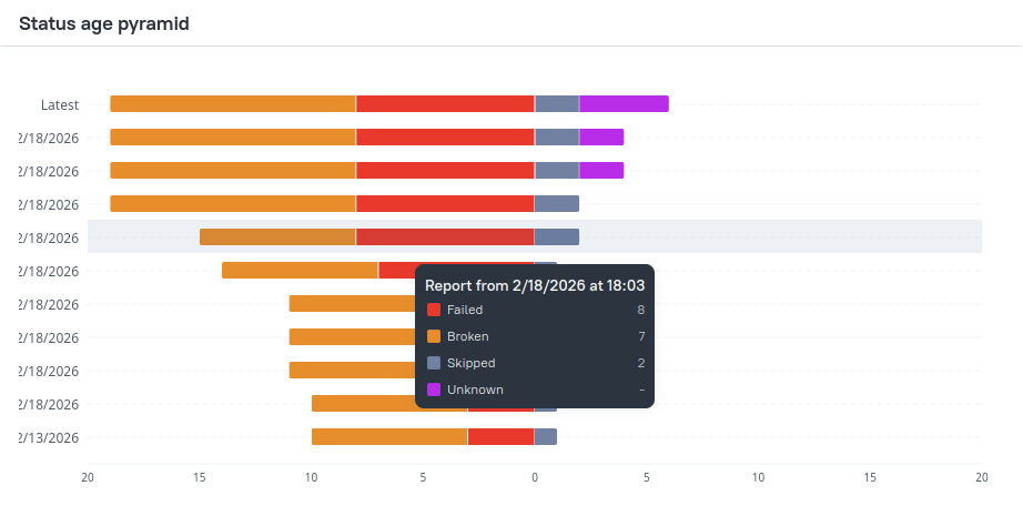
The chart is a vertically oriented stacked bar chart:
- the top bar shows shows the numbers of failed, broken, skipped, and unknown tests in the current run
- the bar for each older run shows the number of tests that had the exact same status in that older run and all the runs since it
The chart is symmetrically divided:
- Right side shows skipped and unknown tests
- Left side shows failed and broken tests
The pyramid layout makes it easy to compare how long different categories of problematic tests persist.
For example, in the chart above, we can observe the following:
- one test was skipped in every shown test run, making its skipped status at least 10 runs old.
- another test started getting skipped 5 runs ago and is still being skipped, making its skipped status 5 runs old.
Allure 3 configuration example
You can set the following options for this chart in the configuration file:
{
  type: "statusAgePyramid",
  title: "Status age pyramid", // chart name
  limit: 10, // number of shown runs, including the latest
}
Testing pyramid Allure 3
This chart visualizes the testing pyramid of your project. It displays the number and success rate of tests by layer.
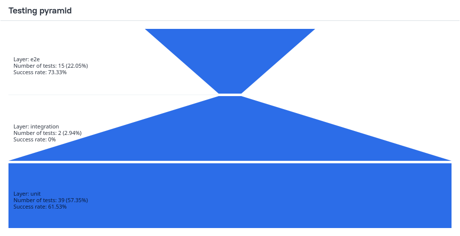
By default the pyramid is built from the following values of the layer label:
unitintegratione2e
You can also configure custom layers to build the pyramid from.
Allure 3 configuration example
You can set the following options for this chart in the configuration file:
{
  type: "testingPyramid",
  title: "Testing pyramid", //chart name
  layers: ["unit", "integration", "e2e"], //layers of the pyramid, bottom to top
}
Categories chart Allure 2
The Overview tab in Allure Report 2 contains the Categories block that presents categories of tests. This includes the custom categories, as well as the predefined categories “Product defects” and “Test defects”, assigned based on test statuses.

Each category is shown as a horizontal line, split into sections of different colors. Sections represent numbers of test with a certain status, with the colors having the same meanings as on the test statuses chart. The number on a section indicates how many tests in the category ended with the corresponding status.
The line that correspond to the predefined categories are not split into sections, since each test in such a category has the same status.
Click on a category to view it in the Categories tab. Click Show all to open the Categories tab and explore the entire hierarchy.
Suites and Features by stories Allure 2
The Overview tab in Allure 2 contains the Suites and Features by stories blocks that present groups of tests from the Suite-based hierarchy and Behavior-based-hierarchy, respectively.


Each group (a suite or a feature) is shown as a horizontal line, split into sections of different colors. Sections represent numbers of test with a certain status, with the colors having the same meanings as on the test statuses chart. The number on a section indicates how many tests in the group ended with the corresponding status.
In each block, only up to ten most attention-demanding groups (suites or features) are displayed. To choose which groups to show, Allure sorts them by the number of failed tests, then by the number of broken tests.
Click on a suite or a story to open it in the Suites or Behaviors tab. Click Show all to open the Suites or Behaviors tab and explore the entire hierarchy.