Reading Allure Charts
Allure Report 3 introduces many new chart types that help your team manage your project and provide different types of insights into your test suite: snapshots of current state, trends over time, project health indicators, and performance metrics.
This guide shows where to start with charts depending on what you want to track.
Insights
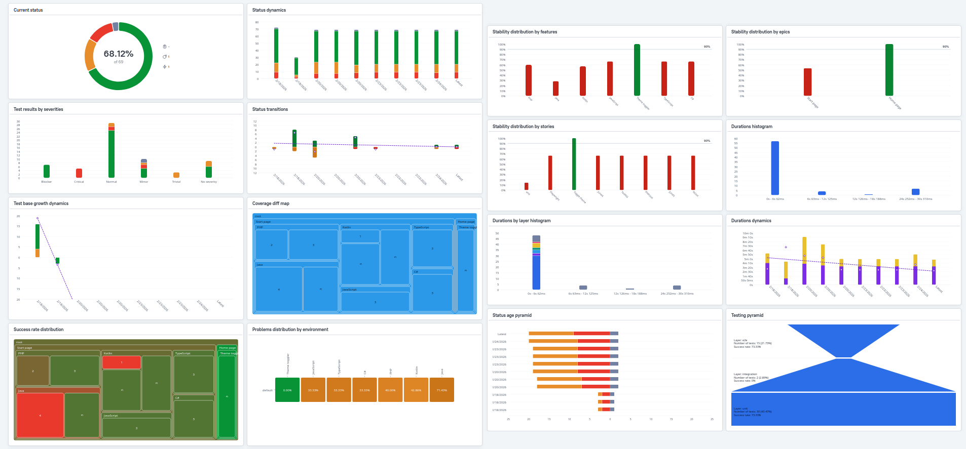
Current state — Get a snapshot of the latest run:
- The more green on the Test statuses and Severity charts, the better.
- The less critical the severity values for failed tests, the better: see the Severity chart.
- Check the Testing pyramid to verify your test distribution by layer matches your expectations.
Trends — Spot patterns and changes over time:
- Watch for upward trends in problem statuses on the Status dynamics chart.
- Monitor Status transitions and Test base growth for unexpected spikes.
Project health — Identify risk areas and stability issues:
- A deep and extensive Status age pyramid indicates persistent issues worth prioritizing.
- The greener the Success rate distribution, the better.
- Unless tests were rewritten or intentionally deleted, there shouldn't be red on the Coverage diff map.
- Check Stability distribution charts to find problem areas.
- Review Problems by environment to spot environment-specific and feature-specific issues.
Performance — Assess test execution efficiency:
- The faster most tests run, the better: see Durations and Duration dynamics.
- Watch for degradation in the speedup coefficient on Duration dynamics.
Roles
Different team members use Allure charts for different purposes. Here's where each role might start:
QA Leads rely on charts for strategic decisions: prioritizing work (Success rate distribution, Status age pyramid), planning resources (Test base growth), and managing risk (Stability distributions, Status dynamics and Status transitions).
Automation Engineers focus on performance and reliability: identifying optimization targets (Durations), detecting regressions (Duration dynamics), and cleaning up flaky tests (Stability distributions and Status transitions).
Manual Testers use charts to guide their testing efforts: finding high-risk areas (Success rate distribution), understanding what changed (Coverage diff map), and prioritizing by severity (Severity chart).
Stakeholders need high-level quality indicators: overall health (Status chart), quality trends (Status dynamics), and test strategy validation (Testing pyramid).
What's Next
Allure Report 3 charts are highly configurable. See the Visual Analytics document to learn how to customize the charts appearing in your reports.